 I stared my career as a finance guy. I loved tabular data and spreadsheets. I looked at a well designed spreadsheet as a piece of elegant art: simple and effective in its communication. Imagine my surprise when I would take this “amazing” piece of financial and data art to a non finance person and they would stare at it with a blank gaze. I would be completely perplexed about how this information didn’t make sense to them. I would have to spend large chunks of time explaining the data and analysis so the person could understand it. Why did this disconnect happen? Why was something so clear to me yet so muddled to another person? The answer was very simple: We looked at (and processed) information differently. A Major Revelation I soon discovered that a majority of my co workers did not process information like the rest of our finance team did. This was a problem for us as our job was to communicate financial data, information, and insights to the business. The question became: how can we possibly hope to find a common method of sharing data and insights with various types of people (quantitative and non quantitative) across the business? The answer? Data visualization, or as I like to call it, visual communication. What is Visual Communication? Visual communication is the transmission of ideas and information in forms that can be seen. It is one of the most important ways that people communicate and share information. To this day I am still a finance guy at heart. However, I have learned that in order to effectively communicate insights, I need to 1) take a “customer first” approach and 2) use visuals to tell a story. People don’t remember facts. They remember stories. A Quick Biology Lesson Thanks to our visual cortex, our vision provides information significantly faster than the rest of our senses. It is on a brain hot line. This leads to us being able to process information visually before we think. This is a result of the way humans evolved. Early humans had threats all around them. If they saw a threat and took the time to process the information there is a good chance they didn’t survive. Despite the fact that most of us don’t have lions chasing us on a daily basis, we still retain these high speed visual response capabilities. Our vision is an incredibly powerful tool. The power and effectiveness of visual communication lies in the fact that it leverages this natural human pathway. It is a common language that can be used to communicate meaning. Why Does It Matter? Visual communication is incredibly underrated in the business world (outside of marketing where creating engaging visuals is a major function of theirs). It is one of the best tools in the tool belt of a business professional to help communicate information and insights clearly and efficiently to a wide audience. A good visualization is an excellent way to see and understand trends, outliers, and patterns in data that might otherwise go unnoticed. It could also be argued that this is the most important part of the information supply chain. This is where the story gets told, people get engaged, and they gain knowledge. Everything up to this point, the algorithms, databases, models, analysis, etc all were done to get here: the point where the business can take action. "Visualizations act as a campfire around which we gather to tell stories." ―Al Shalloway When you are presenting data your goal is to make sure other people can understand, extract insights from, and take action on it. Imagine if you could better engage your executive team and clearly explain how your:
Impossible? Effective visual communication can help accomplish all this! Many people think this topic is reserved for the analyst or manager level person, but it is just as important for executives to be fluent in the art and science of visual communication. I’ve seen far too many executive presentations that clouded the message by 1) trying to get fancy with their chart selection or 2) poorly presented their data. As a result, the message gets lost. "Never underestimate your audience. It’s the most common mistake made by presenters. It is not about you anymore. It’s about your audience’s relationship with your content." -Edward Tufte Why Does Visual Communication Work? It comes down to a few simple factors: • Mental Cost: The vision system is one of the most energetically demanding systems in the brain. Additionally, a lot of mental energy is needed to extract trends and insights from tabular (spreadsheet) data. Our internal processing systems are not optimized for this type of work. Pair a high "vision energy cost" with a large mental "computational cost" (processing text) and you have a recipe for hard work. When you process a visual using our built in perceptive “hot lines” you significantly reduce both the mental and visual cost. • Visuals Are Incredibly Intuitive: Visuals utilize the various colors, shapes, drawings, and photos that we have cultural associations with. Again, we are using well ingrained neural pathways that act as information processing hot routes. • Data + Great Design = Information & Knowledge: Every step in the process of converting data to knowledge needs to add value. When done correctly, data visualization is the step that adds the most value and converts data to information. Once that information is understood and retained then it becomes knowledge. Once knowledge is acquired action can be taken. • Memory: Most people have a limited capacity for remembering digits. Once most people get to 8 or so digits their mental capacity is taken up and they are unable to compare the numbers in their memory. Core Questions To Answer It is best to answer a few important questions before you start creating any visualization. These questions serve as the foundation for the story you are trying to tell. Answer these questions:
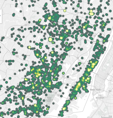
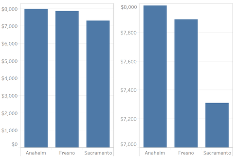
It is important to reemphasize the last bullet. Many people, in their zest to showcase their design skills, will get flashy with their visuals. Don’t do that. In most cases clean and simple will give you superior results. "Graphical elegance is often found in simplicity of design and complexity of data" -Edward Tufte My Approach My team and I usually design for a cross function audience. We aim to make the most efficient visualizations possible. Some people like visuals, some like tables. Some (like me) want both. Graphs work well for the casual data consumer and those that want quick top level insights. Tables work well for those that demand precision. This comes down to knowing who your customers will be and designing towards their needs. I am a huge fan of using a combination of visuals (usually bar graphs) and tables. I usually put visuals on the left and tables on the right. • Visuals – Pros: Enable very rapid and easy processing of information, low mental energy investment to extract trends. Cons: Low level of precision • Tables – Pros: High level of precision. Cons: Can be difficult to clearly see magnitude of differences and trends, requires significant mental energy to identify trends, big tables are mentally processed just like big blocks of text in e-mail: they are painful to read By combining both visuals & tables into one setup we can get the best of both worlds. We start with visuals on the left as that is easier to quickly access and is where our eyes in the US naturally go to (we read left to right, top to bottom). We then progress to the more challenging tables. This setup follows our natural method of taking in information. Visual Design Best Practices DO
DON’T
 Become A Great Story Teller
Hopefully you now have a better understanding of the power of visual communication and how it can help you tell a great, engaging story. I also hope that you see that basic design principles can be employed by anyone in any tool, regardless of current skill level. This article scratches the surface of data visual design and communication. The best way to build your design muscle is to pick up a book and practice. Here is to your visual storytelling success. "Numbers have an important story to tell. They rely on you to give them a clear and convincing voice." ―Stephen Few Like this content? Be sure to join our newsletter list and follow me on LinkedIn. Comments are closed.
|
�
Follow me on LinkedIn for daily content on analytics, data, strategy, and business
Categories
All
|
ServicesResources |
Company |
|